
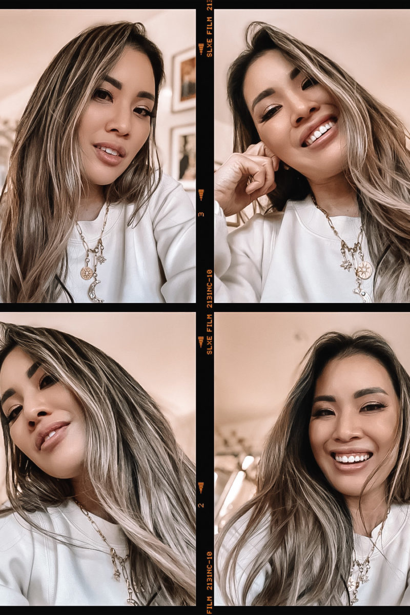
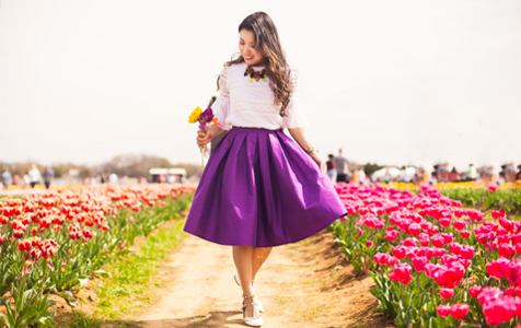
Which picture do you prefer?
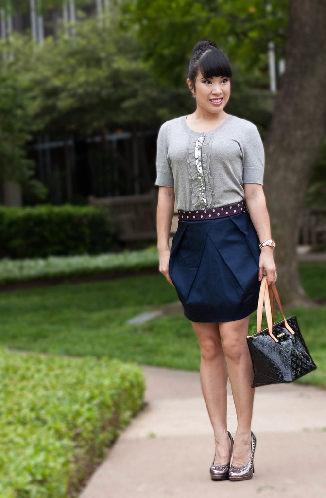
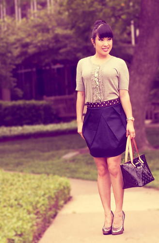
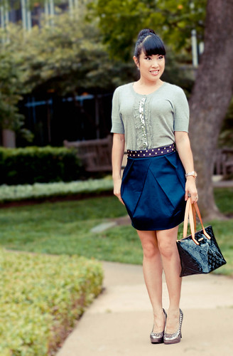
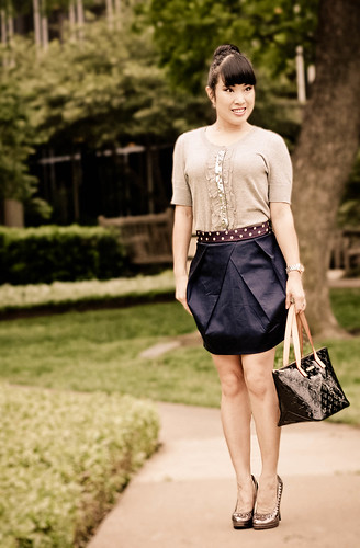
I’ve just spent the last hour of my Friday night playing around with editing pictures and adding different effects. Preferences, anyone? Your decision will affect future pictures you see!
Oh, and a full post will be coming up with this outfit, so in case you’re wondering what I’m wearing, don’t fret! 🙂

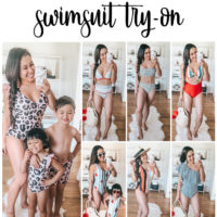
ok so you have to share how your editing these but I love the last one to the bottom right.
Write it in Lipstick
I think I prefer the first one because it seems like it might showcase the actual colors of the garments a bit better than the rest…although that skirt looks a brilliant blue in the third one.
xoxo ~ Courtney
http://sartorialsidelines.blogspot.com
I like the bottom two the best but the bottom left more. It's a nice punch without distorting the true color too much. Also, I think it would be nice if you slightly crossed your ankles in a pose perhaps? I liked the ones in Pants'ed again.
My most favorite photo is the bottom one on the right.
What program do you use, may I ask? I have Photoshop Element 9 but I still don't know much about it.
I really like how the bottom two look 🙂
I like the top left one the best! 🙂
I like the one on the bottom left. It shows off the colors of your cloths really well and its more brighter and clean compared to the others.
I also agree that you need to share your editing skills =]
top left!
http://www.mrschong.com
I like the bottom left
I like the first one because the colors look most true-to-life 🙂
I prefer the picture that is closest to your outfit's true colors…which I assume is the top left. I like reading the petite fashion blogs to view items that are currently available, and I do not want to be fooled into thinking an item is something it is not. :p I do love the other pictures…they are very pretty. Perhaps you can find a way to use both?
I like the one on the bottom right!
I like the first one because it seems to be the truest to real life and the bottom left because it is a bit brighter however I think it may become too bright at times
The two on the left! The colours are much truer, which is part of the point, but even the textures are altered with photo editing. The bottom right picture looks appealing and draws more attention to you, but your skirt looks almost like leather!
I like th first one and the third one (these photos are in a single line for me on my mobile). I like the coloring of them, they seam more natural, and the third one nicely emphasizes your garments colors. What editing tool do you use?
I like the bottom left… I like to see the actual colors of the outfit. It seems a bit brighter and warmer than the top left (which I also like) and there's not much distortion from what I would think is the actual image.
The editing on both pictures just give it that extra *humph* i wonder if i spelled that right.? The originals are just as beautiful, but i think it's always nice to see how versatile pictures can be. Just like an outfit. 🙂
I like the photo on the bottom left. The colors are more enhanced in that pic
-jean
tootsiejean.blogspot.com
I prefer the one on the top left, it's most true to life and I think it makes more sense to show off the true colors of your outfit. I play with effects from time to time too to mix it up, but in the end I love the more natural version best. =)
I'm a sucker for cross-processing so definitely it's the bottom right for me. Cute outfit!
I like bottom left and top left 🙂
I love your blog!
Nice outfit! Inlike the last pic, vintage perfect!
top left
Please share how you did these!
The first one's a tad dark. The second one looks much too adjusted. The third one is very pretty. The fourth is lovely as well and it has a bit of that vintage tinge.
I really enjoy seeing you develop your blog. I'm learning a lot.
We did have a lot of people come to the Arizona Blogger Meetup. Many more than I expected.
Either one on the left. I like being able to see the true colors of an outfit. It makes all the difference!
you can do this in a program called Picnik.
I like the 3rd one. It seems enhanced just enough to bring out the darker colors, like you hair and your skirt, without being too yellowed like the second and fourth option. Isn't editing fun? It's amazing how fast you get sucked in and the options are endless!
my fave is the first one bc it seems to show the true colors and what the outfit would look like in person BUT I think it would be fun if you did the others too every once in a little while to spice up the photos…specially the second one. 😀
Lidi @ Eclectic Flair
Uh oh, your top left picture isn't showing up for me. Out of the other 3, I love the top right and the bottom left, but I think the bottom left more just because it doesn't distort the colors as much.
They all are so pretty Kileen! My fave would be number 3. I like how you just altered the exposure?? I really have no idea what it is called but it looks great!
picture fixed! sorry about that! 🙂
I changed just about everything with the picture actually: exposure, color
curves, levels… you name it. 🙂
bottom left 🙂
rockoomph.blogspot.com
i think for the purpose of this fashion blog, #3 (bottom left) is the best. it has the perfect amount of sharpness and color. you're becoming a pro at this! since we're on the topic of pictures, do you mind sharing what you shot this in (ie. fstop, shutter speed, iso, etc.)? 🙂
I like the bottom left one!
Monique xx
misszuman.blogspot.com
I like the bottom left. Looks like a standard picture, but the colors are punched up a bit.
http://www.brooklynbliss.wordpress.com
The top left is too blurry, top right distorts the colors too much. Bottom left is my favorite! Shows all the colors to its full advantage. Bottom right could work with certain outfits because it has a vintage feel, but doesn't seem quite right for this one.
I just LOVE the tone in the top right photo! And you can see the details in your outfit so much better!
I don't mind the photoshop effects at all! Think I like the sepio one a lot! Although I like to see colors of your outfits that always happen to be so colorful and cute! Navy and grey look so chic and preppy, that skirt is so unique!
Cess O <3.
The Outfit Diaries
I like the bottom left but in all honestly- they are all pretty freaking cool! 😀
Whichever one shows the true colour… which I assume is the 3rd one?! 😛 It looks more natural
bottom left – shoes the real colors of your outfit. bottom right is kinda cool too though.
I'm a sucker for cross-processing so definitely it's the bottom right for me. Cute outfit!
I like the bottom left photo. I generally prefer no effect on photos, but it wouldn't keep me from reading your blog (you've already got me hooked). I think a lot of filters and effects really warp the color and make it more difficult to see the outfit in all its beauty.
that's what i ended up deciding too. no filters or effects, just the
natural look of the clothes. thanks for the feedback! 🙂
I particularly like the bottom left one, but top right is also good!
i wonder if anyone picked the upper left hand corner pic.
a few did. but most people who picked the bottom left one did so because
they thought it looked the most natural and showed the colors better. and
while that filter worked ok for this picture, it actually is horrible on a
large majority of pictures… so in the end, i think i might end up using
filters for special occasion posts where that kind of effect might work out
better, but i don't think it's an everyday filter. 🙂
I like the top left one, for outfit photos, anyway. I feel like the colors are most true in that one.
Thanks! I ended up going with that one. 🙂
Kileen
They are all wonderful, but I think I like the third one best (left bottom corner).
this is all done through Lightroom and Photoshop. 🙂
bottom left
top left is 2nd
(this is a late response so you probably already decided.)
Nope, thanks for the response! I've been using a slight variation of the bottom left since people liked that one so much! Thanks!! 🙂
Kileen